
14 May 2021
Core Web Vitals: The Essential Guide to Image Optimisation
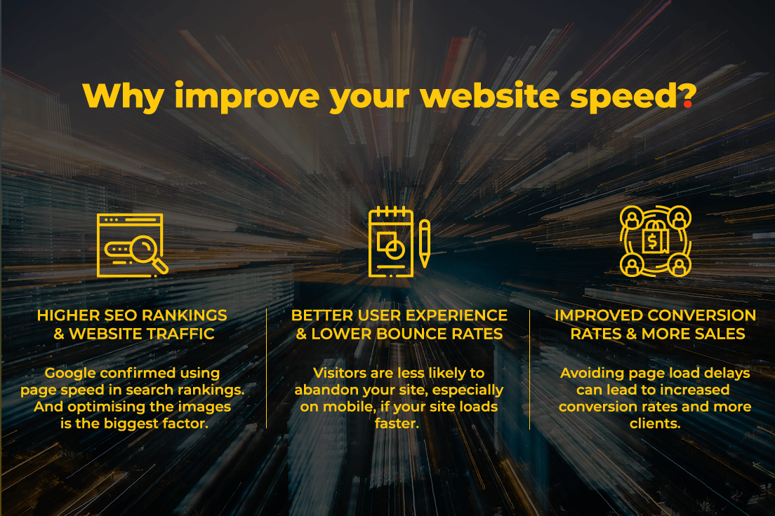
For many years now, Google has made it clear that if your website isn’t fast enough users aren’t likely to stick around. Loading speed is now an influential ranking factor and, subsequently, impacts your positions in the SERPs. User experience has long been a focus of SEO too; combined with on-page, crawl errors and backlinks. But with the major ‘Core Vitals’ algorithm update in August 2021, technical SEO and site performance have never been as important.
Better technical SEO performance can lead to a higher position in Google search results and whilst it’s essential that your site developers, SEO team and content creators proactively work together to ensure a great user experience, simply optimising images is now a powerful way to improve your site’s Core Vitals.
So, with that being said, we are going to take you through how to easily and efficiently optimise your images for a faster and healthier site that Google approves of.
What you’ll learn in our guide to image optimisation;
- What are Core Web Vitals
- The Core Web Vitals Google Algorithm Update 2021
- How to Audit your Site
- What you should Fix and how you can Improve Performance Core Vitals
- Why you should be Focusing on Optimising your Images
- What is Image Optimisation
- Image Conversion: what it is and Tools available
- How to Choose Next-Gen Formats for your Images and Plugins available
- Image Compression: what it is and Tools available
- Image Sizes: how to Choose the Right Aspect Ratio
- Full SEO Image Optimisation Checklist
Let’s get started…
What are Core Web Vitals?
First things first, what actually are Core Web Vitals?
Core Vitals are a set of performance metrics, aiming to measure and assess real-world user experience related to speed, responsiveness and visual stability.
According to Google, page experience is a set of signals that measure how users perceive the experience of interacting with a web page beyond its pure informational value. The idea behind page experience is to make your website the best it can be for users.
In layman’s terms, Google wants sites to load quickly and minimise the amount of on-page movement caused by the loading of elements.
The Web Vitals metrics are split into Core Web Vitals and non-Core Web Vitals.
The Core Web Vitals are;
- Largest Contentful Paint (LCP)
- First Input Delay (FID)
- Cumulative Layout Shift (CLS)
And the non-Core Web Vitals are;
- Total Blocking Time (TBT)
- First Contentful Paint (FCP)
- Speed Index (SI)
- Time to Interactive (TTI)
Why Core Web Vitals are so Important
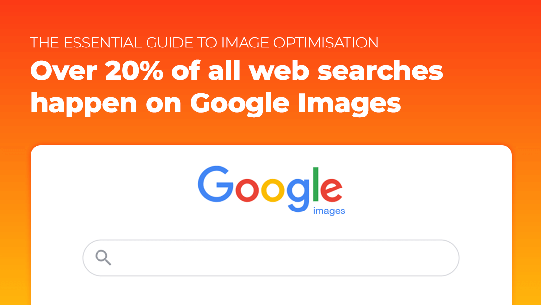
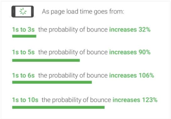
These Core Vitals aren’t just for SEO – Google’s studies show that for pages that meet the thresholds of Core Web Vitals, visitors are 24% less likely to abandon the site and over 20% of all web searches happen on Google Images, according to 2018 data from Jumpshot.
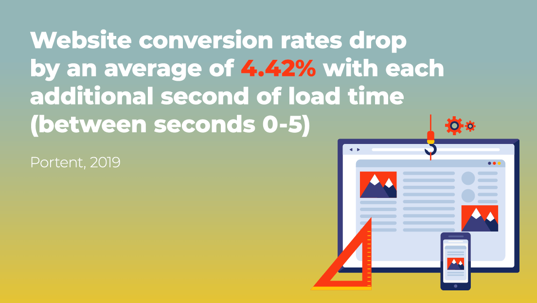
And furthermore, according to Hubspot, website conversion rates drop by an average of 4.42% with each additional second of load time (between 0-5 seconds).
These stats speak volumes and give us an idea of how important site performance actually is – the faster your web page loads the higher your site is ranked.
So why now…?
Core Web Vitals and The Google Algorithm Update 2021
Google is ready to gradually launch its Page Experience Algorithm Update with Core Web Vitals becoming ranking signals from mid-June and it comes into full force in search rankings at the end of August.
What makes this Algorithm Update so Important?
If we try to understand the motive of this core update carefully, we will see that Google Search has really put users on its top priority.
It’s on a mission to adapt its new Google core algorithm update to ensure that the sites with optimal loading, interactivity, and visual stability are prioritised (providing content and other ranking factors are well optimised). It will ensure that sites that rank the highest are not creating experiences that users do not like.
Google’s Focus on User Experience:
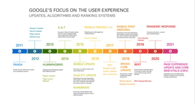
What will Google Analyse in the Update?
Some of the factors included within the update are currently part of Google’s algorithms, so it seems that Google is pulling the various elements to form one algorithm:
- HTTPS – a secure website with a security certificate
- Mobile-Friendly – website content changes size to fit the user’s screen without reducing the amount of content
- Page speed – ideally your pages will load in less than 2.5 seconds – images can impact your page speed dramatically
- Intrusive interstitials – pop-ups that take up too much of the screen on mobile, unless it is a cookie policy
- Safe browsing – making sure that your site isn’t compromised by malicious software
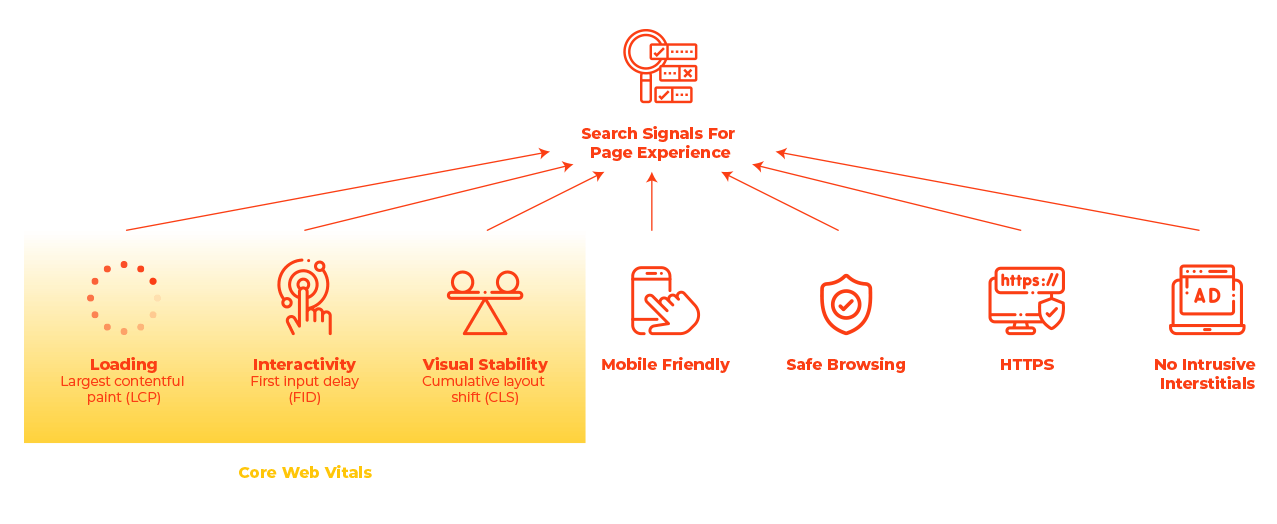
Here are the three Core Web Vitals signals that will roll out this summer, as part of the Page experience update:
- First Input Delay (FID)
- Largest Contentful Paint (LCP)
- Cumulative Layout Shift (CLS)
How it looks all together:
What can I do to be ready for Google’s Algorithm Update?
We’d recommend starting with a full digital marketing audit and evaluating where your site currently is. At the end of this article, we have a number of tools you can use to fully analyse your site, but we’d recommend starting with https://web.dev/measure/ on your homepage; a key landing page and content page.
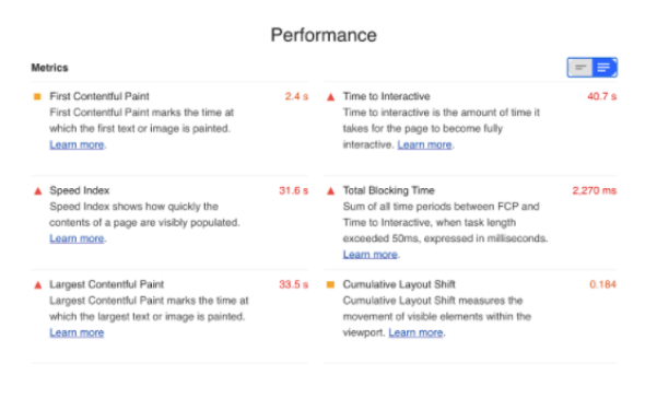
How your Site is Measured
An automated tool for improving the quality of web pages is needed to measure your site and it will be audited in the following categories:
Performance
Audits for metrics like first paint and time to interactive to determine lag.
Accessibility
Checks for common issues that may prevent users from accessing your content.
SEO
Checks for best practices to ensure your site is discoverable.
Best Practices
Looks for everything from HTTPS usage to correct image aspect ratios.
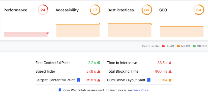
The technical SEO audit will show you where you need to focus your efforts in order to improve the performance. We would recommend you work with your SEO team or partner and developers to fix as many of the issues as possible. Some of the issues will be fairly technical and may require amendments to javascript, CSS and code.
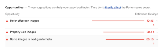
Other ways to Audit your Site and check your images…
For site owners wanting to gauge how their websites measure up to the new ranking signal; Google has updated its Lighthouse and PageSpeed Insights tools to surface information and recommendations about Core Web Vitals.
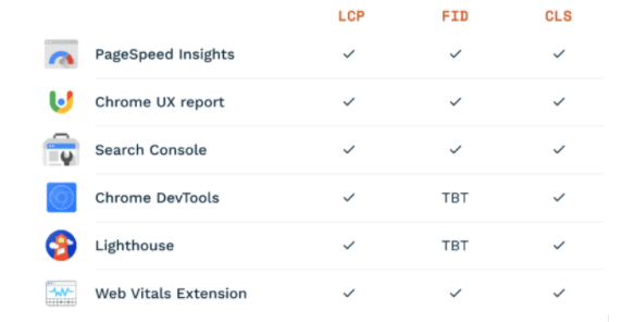
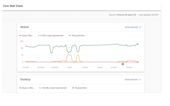
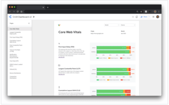
Google Search Console
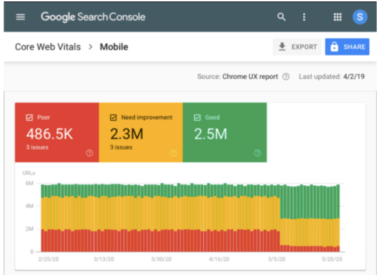
Google Search Console provides field data for both desktop and mobile devices for all your verified properties. When you head over to Enhancements > Core Web Vitals, you’ll find the following screen:
PageSpeed Insights
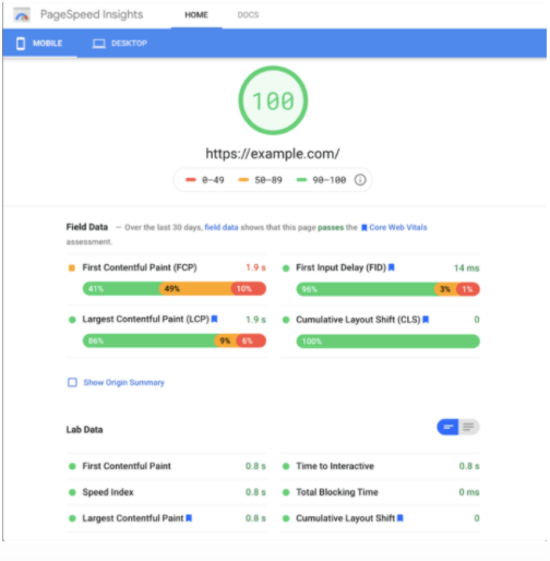
PageSpeed Insights (PSI) reports on the lab and field performance of a page on both mobile and desktop devices. The tool provides an overview of how real-world users experience the page – powered by the Chrome UX Report – and a set of actionable recommendations on how a site owner can improve page experience – provided by Lighthouse.
Lighthouse
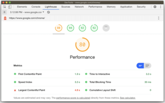
Lighthouse is an open-source initiative that diagnoses pages, helping you to improve their performance based on lab data. Lighthouse is used by various web performance tools – such as PageSpeed Insights and Web.dev Measure, and it is included in Chrome DevTools, so you won’t need to install any extensions.
Chrome DevTools
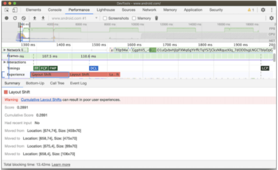
The Chrome DevTools Performance panel has a new Experience section that can help you detect unexpected layout shifts. This is helpful for finding and fixing visual instability issues on your page that contribute to Cumulative Layout Shift.
CrUX
The CrUX Dashboard allows you to easily track an origin’s performance over time, and now you can use it to monitor the distributions of all of the Core Web Vitals metrics. To help you get started with the dashboard, check out the web.dev tutorial.
Chrome UX Report
The Chrome UX Report (CrUX) is a public dataset of real user experience data on millions of websites. It measures field versions of all the Core Web Vitals. Using this data, developers are able to understand the distribution of real-world user experiences on their own or even competitors’ websites. Even if you don’t have RUM on your site, CrUX can provide a quick and easy way to assess your Core Web Vitals.
Web Vitals Extension
The Web Vitals extension measures the three Core Web Vitals metrics in real-time for (desktop) Google Chrome. This is helpful for catching issues early on during your development workflow and as a diagnostic tool to assess the performance of Core Web Vitals as you browse the web.
What can you Fix without Development Work?
Although there will be technical issues, luckily there are a number of things you can address without development work or a deep technical understanding. For example:
- Compressing/resizing/optimising images
- Upgrading your hosting service
- Redirecting broken links/pages
- Observing user behaviour via a heat-mapping tool for ques on how to improve user flow and navigation
So, why Image Optimisation?
A picture tells a thousand words! Images on your website serve much more of a purpose than making your design look good;
- More views and clicks
- Bringing your product to life
- Higher search engine ranking
- Fuels Social Media
Images communicate ideas instantly, but they are also a lot heavier than text to load. This means that it’s essential to get loading and displaying them right if you want to give your users a fantastic first impression.
N.B. If you need help understanding the concept of copyright images, infringement and image licences, check out our definitive guide to Copyright Images in Social Media.
With only a basic understanding of your CMS (content management system), anyone can optimise an image for performance.
Image optimisation helps in;
- improving page load speed
- reducing bounce rate
- boosts websites’ SEO ranking
- improves user experience
- Improves conversation rates
What is Image Optimisation?
Optimising web images is a process of delivering high-quality images in the right format, dimension, size, and resolution while keeping the smallest possible size. Working on these criteria can significantly improve the Core Vitals performance metric.
How do Images Impact User Experience and Core Web Vitals?
Images often make up a large chunk of the data required to load a page, so they’re usually the first port of call for making any improvements to site speed. In many modern web experiences, images tend to be the largest visible element when a page completes loading and has a huge impact on the CWV.
Understanding Core Vitals Performance Metrics
Let’s get a little more technical…
Image optimisation is scored under the ‘performance’ measurement and where the following three metrics come into play and how the page is ‘painted’:
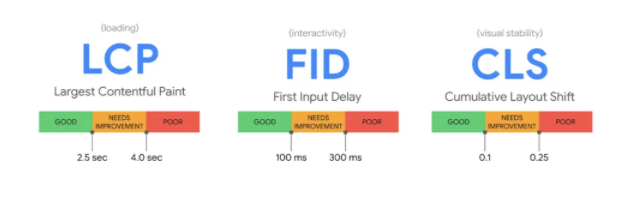
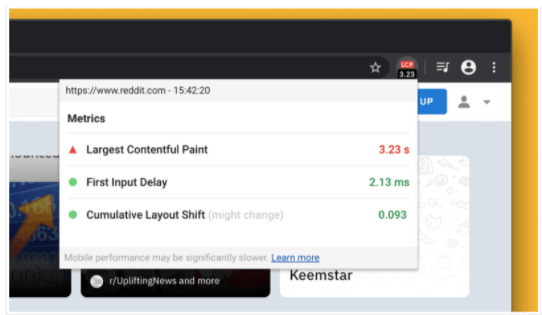
Largest Contentful Paint (LCP)
LCP refers to how long it takes a page to load for someone who visits your site. In other words, it’s the time it takes a user to see your page’s main content on their screen after clicking your link in the search engine results.
Do you know how fast a visitor can see the text, images, and videos on your page? If you don’t, you can quickly check your LCP score using Google’s PageSpeed Insights tool. Go to PageSpeed Insights, and then enter your website address or the web address of a specific page on your site. Click ‘Analyse’ and see what shows up.
The great thing about this tool is that it shows you how your site has performed in the real world, based on Chrome browser data. For example, for LCP, Google recommends sites to load within 2.5 seconds. That’s considered a good web vitals score.
First Input Delay (FID)
First Input Delay, also known as Interactivity, refers to how long it takes a user to be able to interact with a page on your site. Unlike the first signal, this second one is a more direct measure of user experience.
So, what does it mean to interact? It means to take any action on your page, such as:
- Clicking or tapping on links and buttons
- Filling out a form and submitting it
- Tapping to open your site’s navigation on a mobile device
- Playing a video
With this signal, Google looks at whether or not your website is usable by how long it takes a user to do something on your page. Just like with the first signal, Google buckets FID scores into three ranges: good, needs improvements, and poor.
By Google standards, an FID score of below 100ms is ideal. This means that when a visitor lands on your site and clicks on a button, your site needs to acknowledge, respond to that click, and load the requested content within 1/10th of a second.
You need to ensure that your site works properly and that it responds quickly to any action that users take, whether it’s a click on a Buy Now button or a tap to play a video. Just as with LCP recommendations, consider removing any 3rd party plugins you don’t use or need so your pages can load faster.
Cumulative Layout Shift (CLS)
Cumulative Layout Shift refers to how stable a page is as it loads. For example, if you visit a page on a site and elements start to move around as the page loads, that’s not a good user experience. CLS looks at how long it takes for elements to stop moving around as the page loads.
By Google standards, a CLS score of below 100ms is ideal.
This signal is even more important for mobile users since elements like images tend to shift around on smaller devices. So when you look at your CLS scores, make sure you review them for both mobile and desktop as they might differ.
The way to improve your CLS score is to optimise the images, videos, infographics, and other media on your site. You want to ensure they display properly right away according to the device used, be it desktop, tablet, or mobile.
What can you do now to Optimise Images?
So how do we actually optimise images? The two main elements to focus on when it comes to image optimisation: conversion and compression;
- Image Conversion – an image converter software can help you convert a specific image format to the desired format conveniently.
- Image Compression – the process of encoding or converting an image file in such a way that it consumes less space than the original file. It is a type of compression technique that reduces the size of an image file without affecting or degrading its quality to a greater extent.
How to Convert Images into Next-Gen Image Formats
Over the last few years, there has been a rise in next-generation image formats to make the web lighter and more accessible.
JPEG 2000, JPEG XR, and WebP are modern image formats with superior compression capabilities and with outstanding quality to please the web natives. This means they produce much smaller image files so you can greatly improve your page speed by using next-gen formats.
Choosing the Right Next-Gen Formats for your Images
Here are the 3 main types of next-gen image formats you should be considering when uploading your next image:
JPEG 2000
JPEG 2000 is a newer incarnation of the JPEG format. The primary purpose of the format is to preserve metadata through radical compression techniques. While most traditional JPEGs have a limited set of metadata for photographs, JPEG 2000 uses structured XML to include a vast array of metadata information.
JPEG XR
JPEG XR is yet another next-gen JPEG format and a close cousin of JPEG 2000. JPEG XRs application is less intense than JPEG 2000 and was designed in many ways to be the successor of the standard JPEG format.
WebP
WebP is the open-source answer to the next generation of both JPGs and PNGs. The primary application of WebP is the web and is routinely 25% smaller than both optimised PNGs and JPGs. WebP is the leanest and typically achieves 30% more compression than JPEG and JPEG 2000.
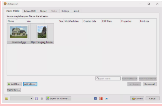
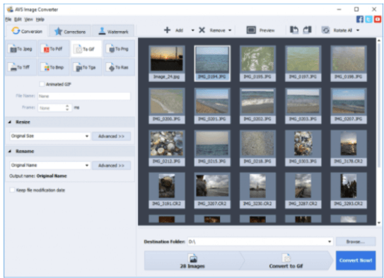
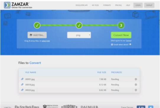
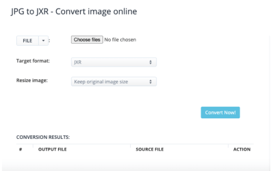
How to actually Convert Images
If you are working with multiple images and looking for a tool to quickly convert them all into one format, here are the best conversion tools available:
Benefits;
- Converts between lots of image file formats
- Can convert multiple images at once
- Lots of advanced settings you can customise
- Converts images on Windows, Linux, and macOS
- A portable option is available
CoolUtils Online Image Converter
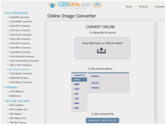
Benefits;
- Converts between lots of image file formats
- Supports different browsers
- Can convert multiple images at once
- Has a privacy safety feature
- No installation necessary
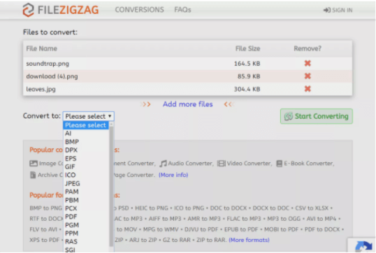
Benefits;
- Really easy to use
- Works from any web browser in any operating system
- Converts images as large as 150 MB (if you log in)
- Supports bulk uploads, conversions, and downloads
Benefits;
- Converts images into a wide range of formats
- A lightweight tool with multilingual support
- You can add a classic touch to your images or apply a black-and-white effect to your photos
- Resizing images can also be done with the aid of this tool
- Can add a personal watermark to your images
Benefits;
- Supports bulk conversions
- Works online, so no installation necessary
- Images can be as large as 50 MB
- One of the easier-to-use image converters
Benefits;
- Converts and compresses images
- Can convert all kinds of documents, e-books, images, icons, videos, audio, and files online
- The letter “A” in the domain name stands for “All” and is compatible with lots of devices
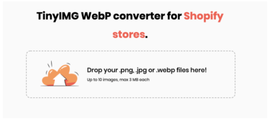
Benefits;
- Sets up WebP images for your Shopify store
- Automatically compresses the size of your WebP images and generates alt tags and filenames for them at the same time
- Directly upload files of different image formats and convert them to WebP, reducing the file size without impacting quality
Which Web Browsers support WebP?
So as WebP achieves the most compression we need to know which browsers are compatible with it in order for the images to work. While browser support has grown a lot, WebP compatibility is still not universal.
WebP images are supported by popular browsers such as:
- Chrome (desktop and mobile)
- Firefox (desktop and mobile)
- Edge
- Opera (desktop and mobile)
You’ll notice, unfortunately, Safari isn’t on the list. Currently, neither the desktop nor mobile versions of Safari support WebP images. Internet Explorer also lacks WebP support (but Edge does support WebP because it’s based on Chromium).
The good news is that in total, around 77% of Internet users use a browser that supports WebP.
How to Serve Images in Next-Gen Formats
So once we’ve converted our images, we need to upload them to our site. Some platforms will only allow limited image formats and as a result, when delivering images in these formats, we should ensure fallback formats (JPG / PNG) are provided for non-supporting browsers.
How to use WebP Images on WordPress
Because not all browsers support WebP images, you, unfortunately, can’t just upload WebP image files in your Media Library and directly use them in WordPress like you can with JPEGs and PNGs.
If you convert WebP images and use them directly in your content, those visitors wouldn’t be able to see your images, which would ruin their browsing experience.
Luckily, there’s a solution. Instead of uploading WebP images to WordPress directly, you can use a WordPress plugin that converts your original images to the WebP format and also provides the original image as a fallback if a visitor’s browser doesn’t support WebP.
For example, if you upload a JPEG file to your site, the plugin will:
- Convert the JPEG file to WebP and use the WebP version for visitors browsing with Chrome, Firefox, etc
- Show the original JPEG file to visitors browsing with Safari and other browsers that don’t support WebP
This way, everyone can see your image and as a result, your site is more likely to be ranked higher. Win, win.
Below, we’ll run through some of the best WordPress plugins:
Pros;
- Unlimited file size
- Compression of JPEG, PNG and PDF
- Automatically compresses images, scales them to fit the page and device size, and converts them to the next-gen WebP format
Cons;
- To be able to use lossy compression for JPGs, you need to register a paid plan on their website
Pros;
- Very easy to use – great for beginners
- Unlimited image uploads and compressions
- Able to bulk upload
- No size limits to image uploads
- Converts to WebP and next-gen formats
Cons;
- The free version doesn’t require registration but offers lower quality compressions
- WP Smush gives you no control over how much you can optimise an image
Pros;
- Provides automated and white-labelled performance reports
- Provides complete cache suite to dramatically speed up the load time
- Offers Gzip file compression
- Provides uptime and server response time monitoring
Cons;
- Pricing is very expensive If you run just one site and don’t need all of the additional tools
Pros;
- Reduces the number of HTTP requests mechanism and improves the loading time
- You can lazy load thumbnails, all images in post content or in a widget text, avatars, smilies and iframes
- You can also replace YouTube iframes with a preview thumbnail to further speed up the loading time of your website
Cons;
- Some type of lazy loading can cause search engine indexing issues
- For people who scroll through content quickly, lazy loaded images can create a poorer experience
Pros;
- Has a great user interface
- Reduces large file sizes of PNG and JPEG
- Provides background automation to speed up workflow
- Offers compression of animations
- Can preserve metadata
Cons;
- It only supports JPEG & PNG
- It doesn’t provide any type of lossless compression
Pros;
- Compresses JPEG and JPEG2000 / next-gen, PNG, GIFs and PDF
- Free to convert to WebP
- Provides Glossy and Lossy compression
- The free membership offers 100 images a month
Cons;
- Unused monthly credits won’t roll over to the next month
Pros;
- Optimises and resizes multiple images
- Able to restore to the original version
- Able to select the compression level
- Free up to 1GB a month
Cons;
- The allowed image formats are limited to JPEG, PNG & GIF only
- You cannot compress images that are bundled with your theme or plugin folder
Pros;
- Able to resize images with the same quality
- Supports WebP / next-gen
- Is a cloud-based system
- The free version is fully functional and offers up to 5,000 visits a month
Cons;
- It doesn’t allow scheduled or individual optimisation
- It doesn’t allow optimisation based on image formats
- The premium versions are very expensive, and they are not suitable for websites with a small SEO budget
Pros;
- Allows you to bulk resize large images in WordPress
- Allows you to choose a default maximum size for your images
- Able to restore to the original version
- Able to select the compression level
- Free up to 1GB a month
- Can automatically convert image file formats from BMP to JPEG, or PNG to JPEG
Cons;
- Not ideal for blogs that require hi-resolution original images to be stored
- While Imsanity does compress JPG images in the process of resizing them, it uses the standard WordPress compression and the resulting images are not efficiently encoded
Pros;
- Able to optimise for mobile and tablets
- Compresses images, resizes and optimises without losing the quality
- Provides a web interface
- Allows the user to change CDN provider
- Provides Cloud storage
Cons;
- There is no bulk optimiser
- The max file size for the free accounts (both in web interface and plugin) is only 1MB
- You cannot compress images that are bundled with your theme or plugin folder
Guide to Compression
The Importance of getting your Image Compressions Right
Image compression plays a significant role in the overall quality of your images. Without the proper use of image compression, you can compromise the size, appearance and overall quality of your website’s images.
The problem with image compression is that most web designers and business owners are more likely to misunderstand and undermine it, especially when it comes to figuring out what type of compression works best. If you aren’t careful in choosing a form of compression for your images, then one of two results may take place after:
- Your images will never look good as they’re supposed to on your website
- The file sizes of your images will be much bigger than they’re supposed to be
All it takes is knowing the difference between all the types of image compression to understand and apply them correctly in your website designs.
Lossless vs. Lossy Compression
To ensure that you aren’t messing up the images in your website design, let’s look at both types of image compression in further detail:
Lossless Compression
Lossless compression can reduce file size through compression without affecting image quality. This process is desirable when you want images with a smaller size to store more or send files faster. All while keeping image quality intact. Some image formats feature lossless compression and let you reduce file sizes without impacting image quality. The drawback is that compression on a high setting takes a longer time.
Standard and advanced lossless compression image formats include:
Lossy Compression
Lossy compression sacrifice image quality for file size. The most standout example for lossy compression on image files is highly compressing a JPEG image. Heavily compressed JPEG files get noticeably reduced image quality with significant compression, making fine details hard to see with an overall “pixel look” on the image.
Standard and advanced lossy compression image formats include:
See the below comparison scoreboard to summarise:
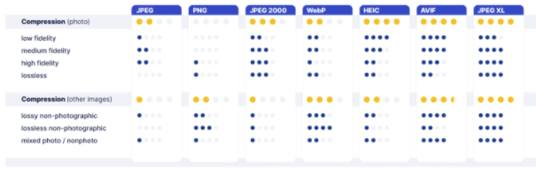
When lossy compression is good enough, e.g., for web images, both AVIF and JPEG XL deliver significantly better results than the existing web codecs, including WebP. As a rule, AVIF takes the lead in low-fidelity, high-appeal compression while JPEG XL excels in medium to high fidelity.
Decoding a full-screen JPEG or a PNG takes only minimal time whereas newer codecs compress better but at a cost in complexity.
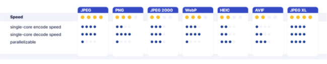
Designed before multicore processors became a reality, older codecs like JPEG and PNG are inherently sequential, that is, multiple cores yield no benefits for single-image decoding. In that respect, JPEG 2000, HEIC, AVIF, and JPEG XL are more future proof.
Compression Tools
So how much compression is actually possible? Why don’t you see for yourself? Below are some of the best online image optimiser tools available and percentage reduction in JPG and PNG files…
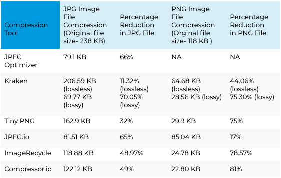
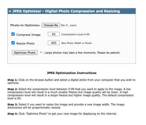
The free tool JPEG Optimizer is one of the first solutions to check out if all you need is to resize and compress JPEG images.
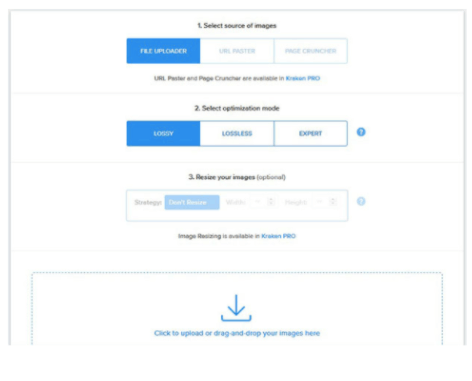
Kraken gives you a choice of compression modes:
- Lossless – zero drop in quality
- Lossy – a small drop in quality, but cuts down image file size by almost 90%

Tiny PNG handles compression of both JPEG and PNG image formats with ease, letting you bulk upload up to 20 images in one go. Each file size can reach 5 MB. For larger files, you’ll have to be a paying customer.
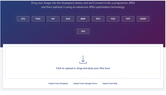
To convert images of any format into JPEG, you can try JPEG.io. It handles more image types than most online image optimizer tools. To use it, you drag and upload your PNG, GIF, SVG or even PSD files to their website. First, the tool converts the images into JPEG and then compresses them before returning the images to you.
If you’ve got images in multiple formats to optimise, you’ll find ImageRecycle to be a safe bet. Not just PNG or JPEG, this tool supports even GIFs and PDFs. You can drag and drop your images onto the website and download the optimized images with a click.
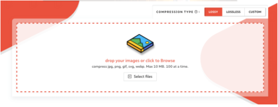
If you’re looking at high levels of compression that can save you hundreds of KB, take a close look at Compressor.io. It can reduce file sizes by close to 90%. It compresses JPEG and PNG images without loss of pixels and lossy compression for other file types. However, the file size cannot exceed 10 MB.
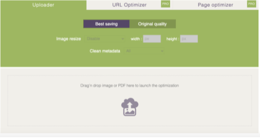
If you’re working with Shopify stores, TinyIMG is your go-to optimisation tool. TinyIMG automatically compresses the size of your WebP images and generates alt tags and filenames for them at the same time. The app then uploads the optimised versions to your Shopify store. You can restore your images to their original state at any time within 30 days.
Choosing the Right Aspect Ratio
Unsure of which size to use for your image or design? Here’s a list of common aspect ratios and popular web image sizes…
What is Aspect Ratio?
The aspect ratio of an image is the proportional relationship of the width to the height. The relationship between its width and height determines the ratio and shape, but not the image’s actual size.
Aspect ratios are a critical part of web content because images need to be uploaded at different aspect ratios for different uses, like desktop vs. mobile or blog vs. social media. When you use the right aspect ratios, it ensures your images are displayed as intended without stretching or resolution loss.
How to Measure Image Size
Unlike aspect ratios, image size determines an image’s actual width and height in pixels. The image size attribute is the dimensions of an image. You can measure image dimensions in any units, but you’ll typically see pixels used for web or digital images and inches used for print images.
Web Image Size Standards
When uploading images to your site, it’s crucial to understand image size specifications because incorrect image sizes may stretch or distort to fill fixed dimensions.
To satisfy several different standard image sizes, upload an image that’s big enough to reduce without losing resolution and small enough to comfortably fit the width of a standard screen.
Best Image Sizes for Websites (dimensions in pixels)
Uploading large images to your site, without regard to the actual size they’re being used at, is what causes huge performance issues.
Regardless of file formats, you should never upload high-resolution images to your site just for display purposes.
Even if your website is only displaying them at a smaller size, the URL for the original images can often be reverse-engineered from the source code, and your images can be stolen. Plus, large images take a lot more time to upload and are slower to optimise.
These are some of the most common image sizes;
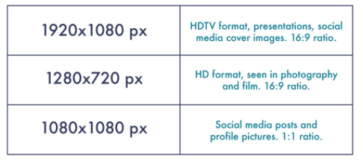
1920 x 1080 pixels
This standard image size is widely seen across high definition TVs, presentations, and social media cover photos. It follows the 16:9 aspect ratio.
1280 x 720 pixels
This size follows the standard HD format featured in photography and film. It fits the 16:9 aspect ratio.
1080 x 1080 pixels
You’ll see this 1:1 ratio image size used widely across social media, namely Instagram and Facebook posts.
Need guidance with Social Media image sizes? Check out our ultimate guide, covering all the key channels.
Further Advanced Image Optimisation
If you want to take your image optimisation to the next stage you can follow these advanced techniques;
- Using different image sizes for the different screens/devices
A great practice to take advantage of is creating variations of the same image (responsive images) and indicate them in the HTML code. This way, depending on the screen size, the right image at the right size will be displayed.
You can learn more in this great guide to the responsive images syntax in HTML.
- Not optimising your website resources
While optimising your website, ensure the ‘used libraries’ are loaded on all pages of the website. This will significantly speed up the loading speed.
Top tips:
- Load your resources/libraries only where/when needed in order to reduce the number of requests, size and loading time
- Aggregate your resources into a single (or a couple of) files
- Remove all the code in the CSS and JS files that are not used. Usually, older sites have a JS file that might reach 1 MB in size which is not acceptable.
Full SEO Image Optimisation Checklist
Although optimising for Core Vitals is a key element in improved user experience, for a guaranteed increase in rankings we recommend fully optimising for search engines. Ensure all of the below points are covered;
- Choose the right image format
- Adjust image dimensions according to your site
- Choose the right compression rate
- Optimise image file names
- Optimise the image title
- Write keyword-rich and descriptive ALT tag for images
- Write clear image captions
- Ensure that your text complements the images
- Use unique images
- Serve responsive images
- Add image structured data
- Ensure images load fast
- Create image sitemap
We hope this guide gives you the head start you need to better understand Core Web Vitals and the elements of image optimisation and be fully prepared for Google’s Algorithm Update.
Our success formula has been distilled from years of experience, covering all elements with a strong focus on user experience, technical SEO and site performance.
Our team is fully equipped to fertilise your digital home and deliver results that matter to you; drop us a line.
Drop us a line.
Consultancy
Strategy & Insights
Digital Marketing
Visual Communications
Campaigns
UX, CX & CRO
Development
Company
Visit us.

Seventh Element
145 City Road
London
EC1V 1AW
